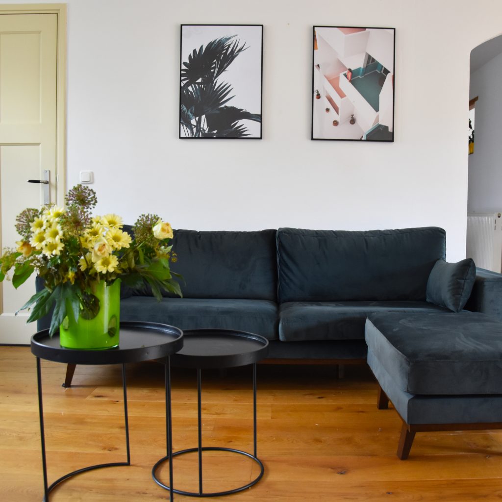
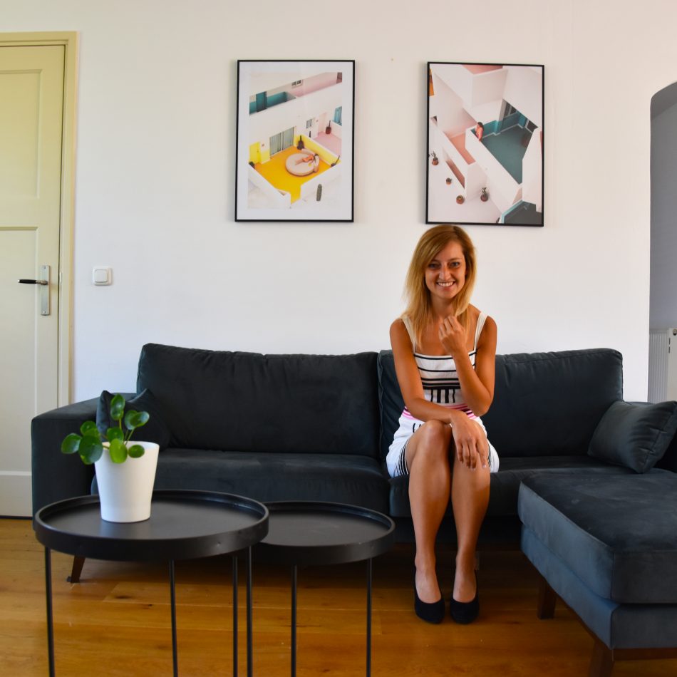
We’ve moved into our ‘new’ house a year ago. And even though I already tried to decorate it when we just moved in, some things just take a bit more time (apparently). One of the things that we looked for for quite some time was a work of art for above the sofa in the living room. And as you can see, we finally found something! On this page I’m telling you all about our new house: the living room and how we decorated it with posters.
As I already told you last September when I published the blog about the downstairs area of our new house, we were looking for something for above the sofa. It was so empty to have just a white wall above it. But we found it very difficult to decide what we wanted. If you go for one big painting, it can be very dominant in the room. And then I’m not even talking about how expensive they can be.
Also, most artwork that we liked was in portrait shape, so lengthwise. And we thought that it would be nice to have something landscape shape, so broad-wise, above the sofa. Otherwise you’d still have two empty white strips of wall next to the artwork.
This is how we came up with the idea that we could also have two portrait shaped posters next to each other. This way you can still get the lengthwise artwork that you like, but it also fills the width of the wall.
Posters are more affordable than most paintings and it’s much easier to replace them with something new every once in a while.
Desenio
Desenio reached out to me when I was looking for posters, and we decided to work together. I went to the Desenio website and saw that they have an enormous collection of posters. From art pictures to archticecture and from portraits to nature photography. Some of their posters are great for children’s rooms and the majority is very suitable for living rooms. If we wouldn’t be able to find something here, I think we’d never find anything!
We have many plants in our living room and a green sofa, so I wanted something with green in the poster. You can easily look for categories on the website so I first went for ‘botanical‘. I found several great pictures of plants and put two different ones but in the same category on my wish-list. They’re called Green Plant and Palm Leaves.
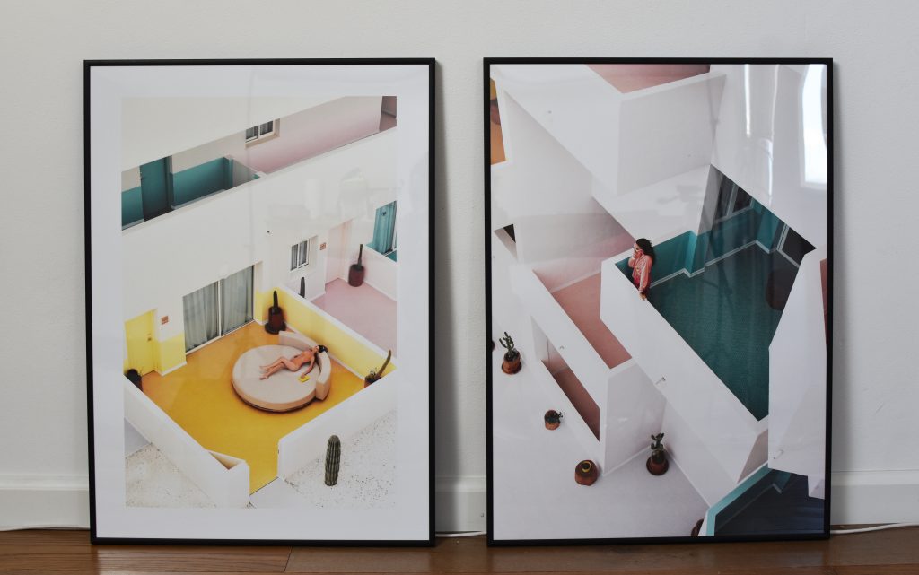
But as I was afraid there would be too many plants in our living room with the two posters and the actual plants, I decided to look a bit further. They also have great portrait photography and architecture photography prints on the website. I went for the architecture category and picked two matching posters of a geometrical apartment building. They’re called The Green Balcony and Chill Out. The walls of the building on the poster are mostly white but there are some great touches of color in it. Including the same green color as our sofa.
I bought 2 poster frames and the 4 posters, so I can mix and match, and occasionally change them.
I’m very happy with the result! It matches perfectly with our green sofa and the black tables. Now on for our next mission… a carpet!










Pingback: We bought a house! - Anne Travel Foodie
Pingback: New self-designed posters for our living room - Anne Travel Foodie
Pingback: Alles over onze achtertuin - Anne Travel Foodie